Why Size Matters In Art
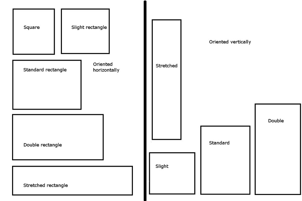
When purchasing art from a gallery or an individual artist, the buyer must acquiesce to the size and format (horizontal, vertical, or square) of the existing piece. In essence, the art itself must dictate where in the home, office, or commercial space it will fit.
However, when commissioning a custom piece, the buyer has the luxury to work with the artist in creating a true balance between the art and the setting. The art can be created to fit the space.
Size
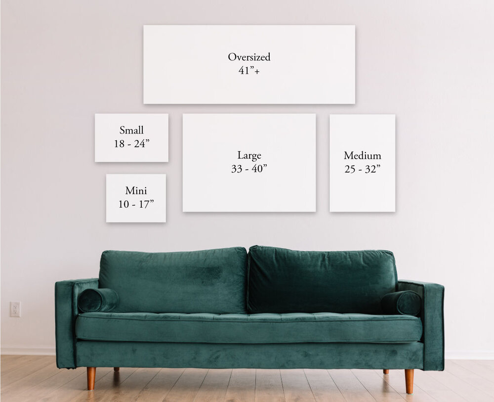
There are two general rules of thumb when thinking about the size of a piece on a wall. First, the painting should take up 50% to 75% of the available wall space. Second, “when hanging wall art over furniture, such as a bed, a fireplace or a couch, it should be between 2/3 to 3/4 of the width of the furniture.”
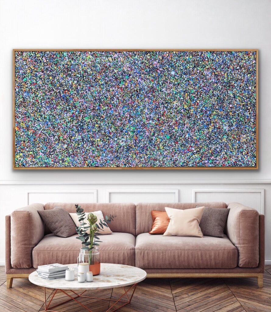
However, as seen in Patrick’s first photo above, where the work fits the exact arm to arm dimensions of the couch, art should also be about personal taste, individual aesthetic. If your home feels right by breaking the “rules”, go for it!
In the commissioning process, the size of the painting will depend on the wall where it will hang in combination with personal taste.
According to Artdex, “Ultimately, size in art matters because of its power to impact the way audiences respond. There’s something about large scale objects that affects our visceral senses and emotions, humbling us with a feeling of reverential respect. This is just as true in our wonderment of nature when we stand beside the massive ocean waves or under a towering giant sequoia”.
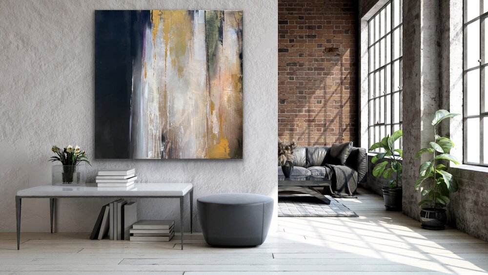
Notice how well Christina’s painting shown above fits both the wall and the surrounding space.

There is also grandeur to smaller paintings. “In direct opposition, tiny works of art also pack a big punch. In opposition to the “bigger is better” culture in today’s modern art world, some artists have chosen to take economy into consideration and focused on not only creating smaller works but to encourage the idea that humankind can function beautifully on a smaller scale, impacting the world emotionally without as much physical impact. Small scale works confuse and disorient viewers, forcing them to focus on what they are viewing, and creating internal discourse.” (Sybaris Collection)
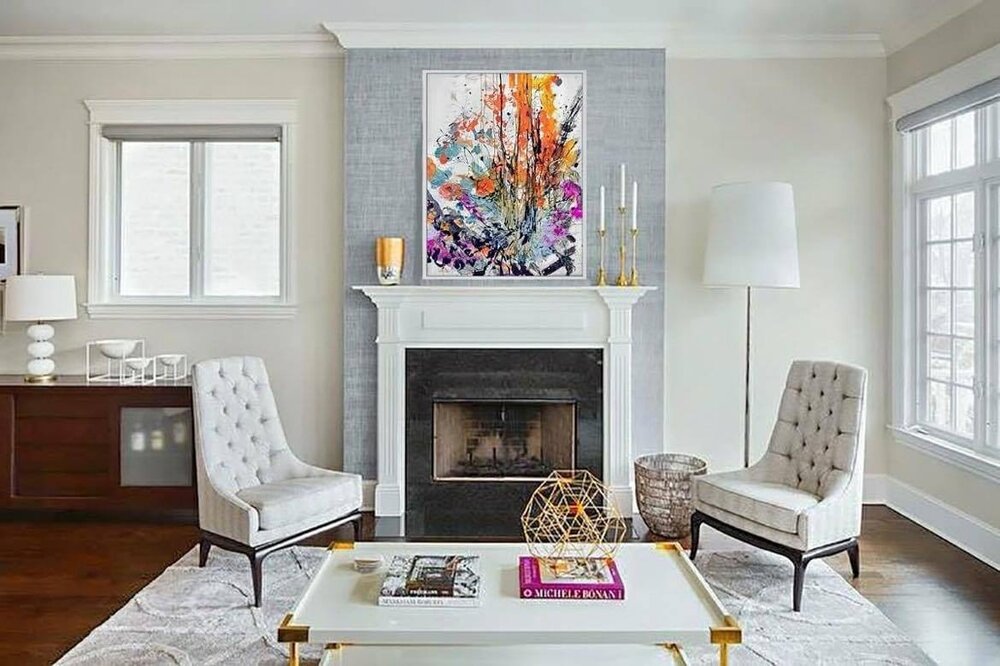
Take Marisa’s work above. In working within a smaller scale, the viewer is forced to focus in, to truly appreciate each stroke, to effectively “see” things differently.
Format
Just as important as size is the format of the painting. According to Artist Network, “The three most common formats are horizontal, vertical, and square. A horizontal format lets the viewer’s eye move across the painting and is used most often for landscapes. A half-sheet horizontal format may be ideal for a panoramic landscape or a reclining figure. A vertical format encourages the eye to move up and down the painting…. A square format isn’t as common as the other two, but it’s ideal when the subject matter is the center of interest.”
Paul’s abstract above suits the vertical lines of the family room perfectly.
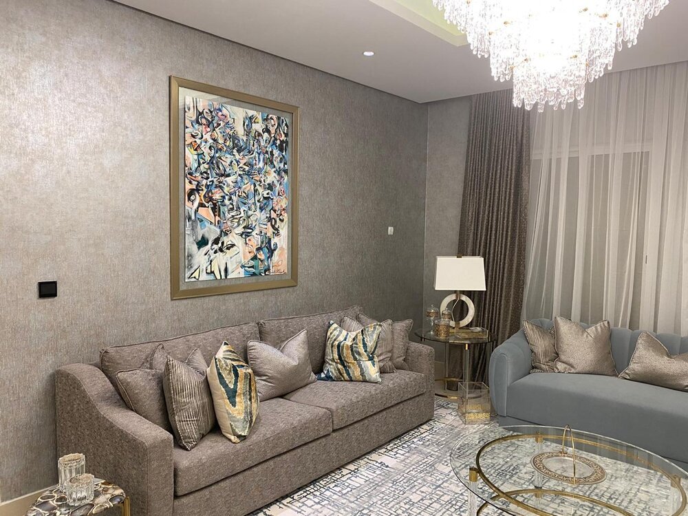
As seen with Antoinette’s painting above, format and size play nicely to disrupt the space. By formatting vertically, the eye is instantly drawn to the painting. It stands out. Perhaps a horizontal painting would not have had the same type of impact, despite the size of the wall. Again, there is a luxury to the commissioning process as the buyer and the artist are able to discuss all aspects of the piece together.
Ultimately, much like art, size and format are subjective to taste and setting. One may stick to the “rules” but be unhappy with the result. Sometimes breaking of the rules leads to a stunning work of art.
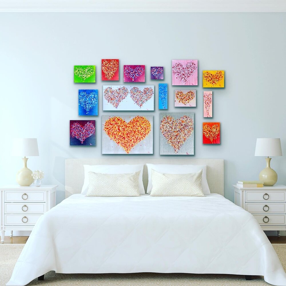
When commissioning, discuss your home, office or commercial space with the artist. Talk about the impact that the art will hold, the message your are conveying, the intention of the piece. Whether one larger painting, or several paintings that will fill the space as seen below, scale is an important aspect. The artist can serve as your guide to make certain that what they deliver aligns with your taste.
Above, Lydia worked with a restaurant group to offer a series of works to perfectly fit their space. In combination, the series unifies the dining space, creating an aesthetically interesting, warm environment.
Below, see how Patrick uses a series of works to fill a room’s walls.
No matter the space, size matters in art, and having a good grasp on this topic is a wonderful way to bring beauty to one’s life. The size and format, notably in the commissioning experience, are vital factors to discuss with your artist.

